Polishing the Graze: Visual Updates
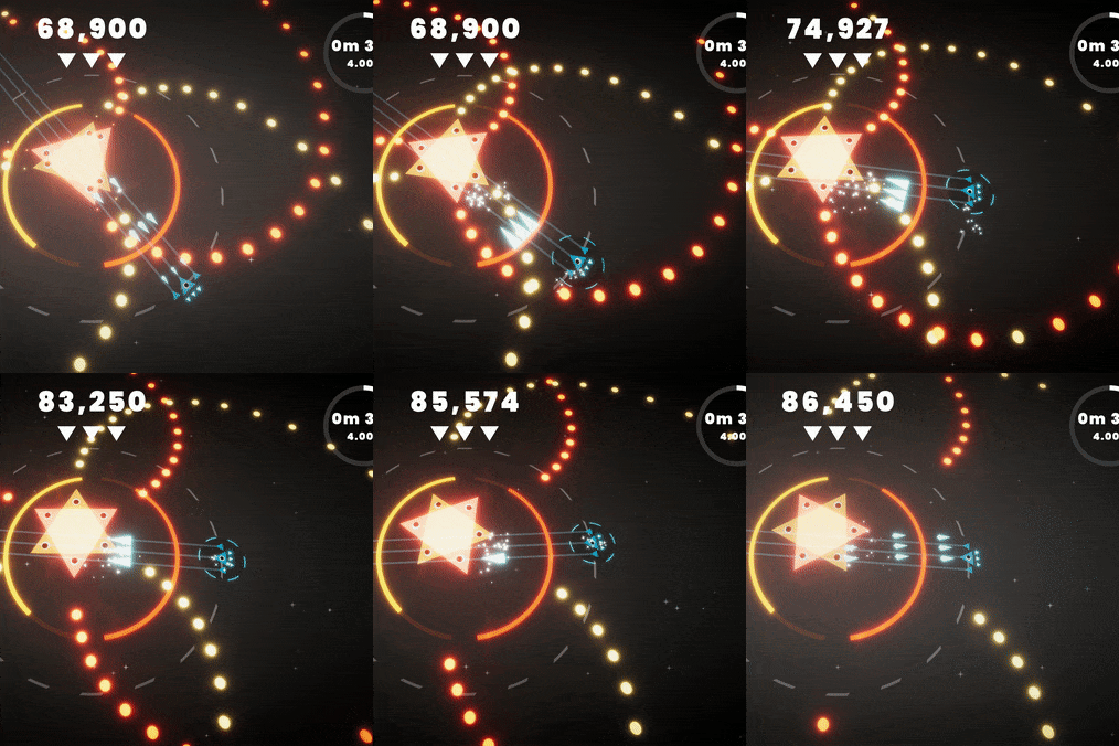
Today I’ve done a touch of work on the visual style - I’ve made the background just a tad darker, and I’ve added some more VFX for grazing. That’s one of the things that has been the same for the entire lifetime of that mechanic, and it could do with a little bit of updating! The
Today I’ve done a touch of work on the visual style - I’ve made the background just a tad darker, and I’ve added some more VFX for grazing. That’s one of the things that has been the same for the entire lifetime of that mechanic, and it could do with a little bit of updating! There are some sparkly particles around the player, some sparkles across the fill screen, and I’ve toned down the full screen post processing for it. Oh and there’s a neat little graphic around the player. Here’s a little look:

What do you think? Let me know on Discord! Does it look too much like a shield? I think it might look too much like a shield… maybe it needs to be a bit more aggressive and spikey?
What’s next?
Alpha soon!